Milk & More
Corporate Identity / 2011
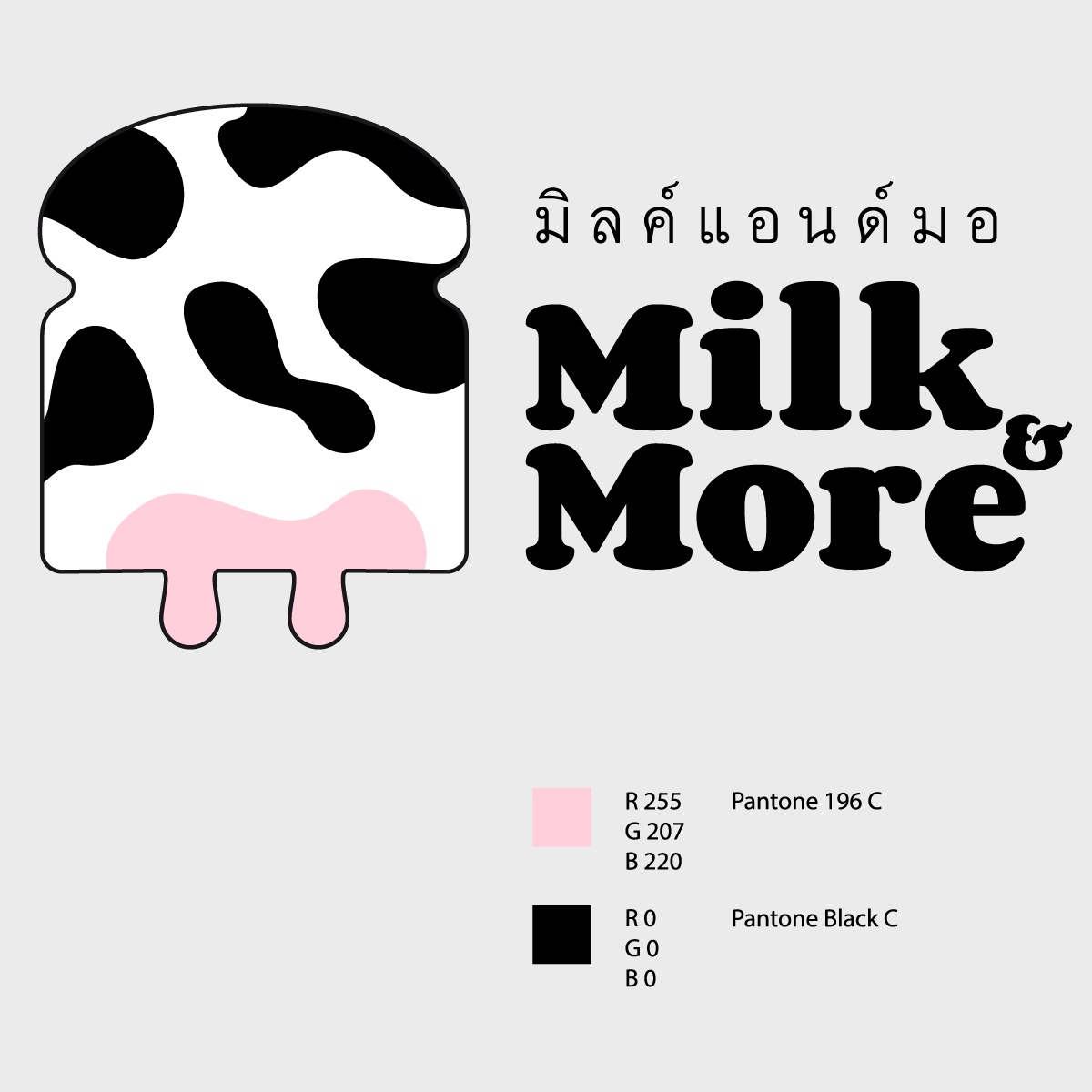
Pronouncing More in Thai means cow sound. Thus, the name of Milk & More is like Milk and Milk. It is more emphasized. Mixing with More meaning in English, Milk & More is the very milky shop that sells milk as main products and other goods. However, in the beginning, it serves milk and bread and other product lines will be served in future.
The major consumer of Milk & More is every range of age so the logo must be translated and understood easily at the first sight of seeing. The client wanted something new and chic. Therefore, I combined the bread shape and cow breast together and used cow pattern to emphasize once more in order to make it perfectly for its concept.
